Card User Interface (UI) is currently the hottest thing about web design on the planet, and everybody seems to have developed a spontaneous liking for such websites. Who knew that something as commonplace as cards could have such an impactful dominance in web design, which is considered to be at the pinnacle of creative adroitness. If you’re wondering what exactly is a Card UI then don’t worry, I’m sure you are immensely familiar with it, just aren’t aware yet.
Everybody Loves Card UI – Google, Twitter & Facebook
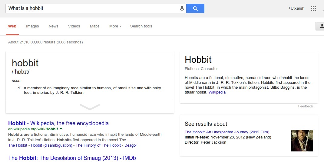
Google, Facebook, Twitter and Pinterest – fuel our digital experience on a routine basis, and you know what – all four of them have adopted Card UI as their preferred choice of information display. In fact, over third of the Google’s search results are showing snippet rich cards, which highlights their heavy use of the design scheme. Not just the desktop versions, Google’s native mobile apps including the Google Now, Google Play and Google Now, amongst others have become the trendsetters of Card UI.
(Google results showing three cards for the search query – ‘What is a hobbit’)
See how Google's self-driving cars know how to navigate city streets http://t.co/Ucn69g3s7S pic.twitter.com/I7rKht6Rsg
— Mashable (@mashable) April 29, 2014
(Twitter using card UI in its tweets)
.
.
Pinterest Transformed Card UI Into Cool Stuff
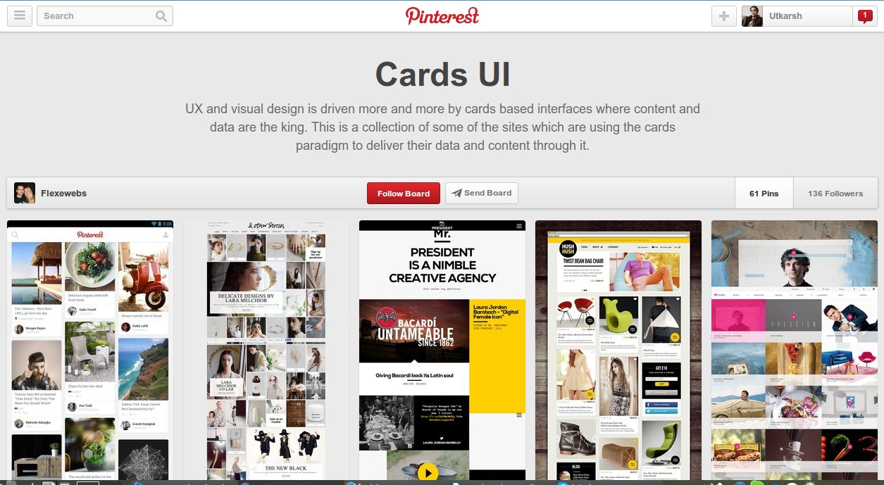
Further, the Pinterest design has become a cornerstone of contemporary web design, most importantly in the case of cards. You’ll see many Pinterest inspired reproductions of card design, including the recently unveiled eBay’s mobile shopping experience for their native apps and mobile web versions. The scheme was immediately accepted by audience worldwide, and now the card UI is identified with Pinterest.
.
.
 (Pinterest – trendsetters in Card UI Web Design)
House of Cards – How Card UI Suddenly Became So Important?
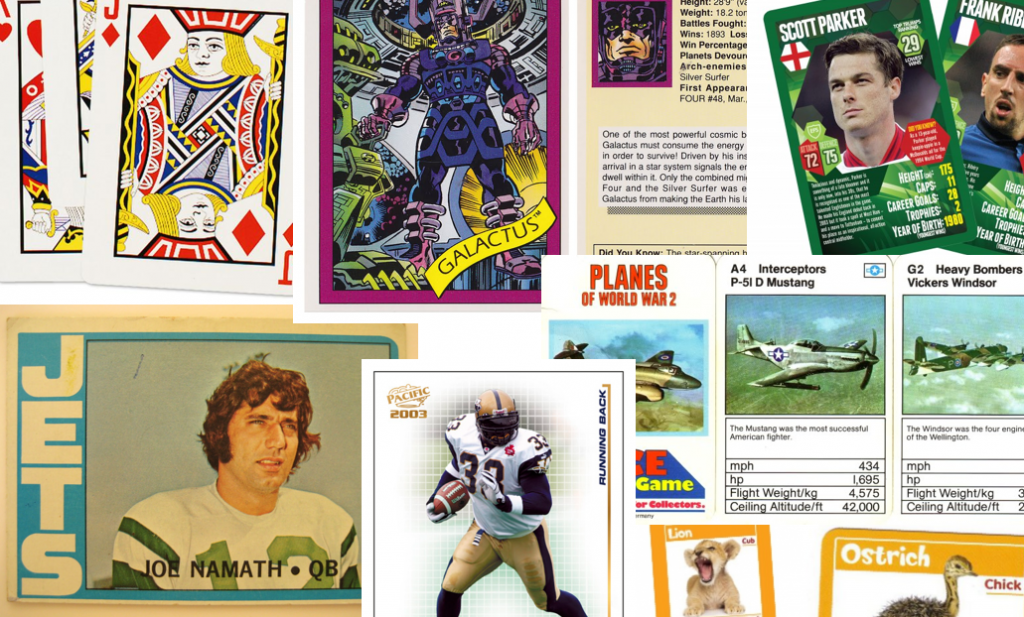
We aren’t aliens to cards, in fact we see them, use them and share them on a daily basis. The card UI became popular on the basis of it being easily relatable and making use of the traditional way of information exchange. Be it business cards, greeting cards or even playing cards, we have become accustomed to seeing and relate to them every day.
The card UI is all about using the traditional concept and putting informational content that should reach its target audience. This design scheme also has a few technical perks of its own, which we will get to later in this article. Few people are aware of the fact that the card UI with its modular content assembly facilitates the embedding of rich media, and thereby fostering community interaction and engagement.
Card UI From Web Design Point of View
To the simple uncomprehending eyes, card UI will seem nothing special and just a sequence of randomly or strategically placed rectangular HTML boxes having little or sometimes even no content. However, there is much to be seen and deduced from their design styling and success.

(Image source – insideintercom.io/why-cards-are-the-future-of-the-web)
Cards show less, say more
Telling a story or a brand narrative via cards can be extremely useful. First – they save time for the user and show him just the key points he/she need to know about a product or a brand, and as soon as they are hooked they will engage using one of the cards they feel like talking about. Second – showing little, but just enough is at times better than showing everything. Information overload can put off some readers, while simply kept neat information works for everybody.
Cards UI and Responsive Web Design are made for each other
Scalable web design is something all designers crave for, and if a scheme has automated scalability in its native design, then it’s like hitting two birds with a single stone. Card UI is ideal for responsive web design, and can be rendered in both horizontal and vertical scaling design. The design is simple, programming is minimal and optimizing efforts are fantastic! Card UI is easily one of the most economical design schemes for responsive websites and are ideal for websites that are meant to be used across multiple devices.
Cards facilitate quick consumable information
I’m sure most of you have some history of playing and trading cards with friends, be it baseball, football, Pokemon, Justice League, or something else. Now the thing to be noted is the attention span we dedicated to the individual cards and amount of information we absorbed from them. We could narrate any Pokemon’s HP, weight, type and super ability just by looking at the card for a fraction of a second. Now imagine that in the present real world – Card UI is ideal for sharing that little pocketed information we loved as a child, which also has a great recall value.
Card look good and serve different purpose
The card UI is modern, sophisticated and ideal for responsive websites. The reason everybody from Google, Facebook and Twitter love cards is simple – they look good, do what they need to do and are easier to read than plain text or graphic diagrams. Further, card UI opens many windows for additional functionalities, such as swiping, stacking, folding or grouping them. Every style is different in itself, and yet immensely effective.

