Apple is indisputably the front-runner of Flat design, and every recent Apple intervention amid the design community had an abundance of this skeuomorphic style. The trend oozed confidence and its open acceptance as a design standard was kind of so sudden that before anybody realized, Flat made its way into user interface (UI) and web design, architecture, ceramics, and interior design.
What is Flat UI Design?
Flat UI is nothing but minimalistic approach towards contemporary design requirements that aid seamless user experience and overall usability of a website, operating system, mobile application, icons, graphics, logos, etc. Flat web design incorporates sophisticated white open spaces, clear edges, and bold colors and fonts. The design elements and graphical illustrations are kept simple as well, maintaining flat avatar.
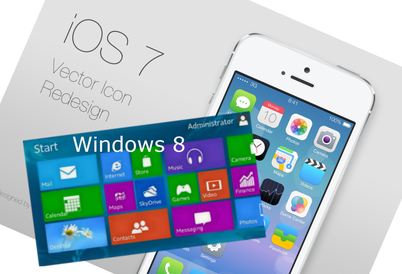
Apple and Microsoft have extensively used Flat UI in their products. For example, the Microsoft Windows 8 Operating System (OS) and Apple iOS 7 mobile OS were the first initiatives towards flat design that saw global acceptance.
Let’s see some examples of Flat UI done great!
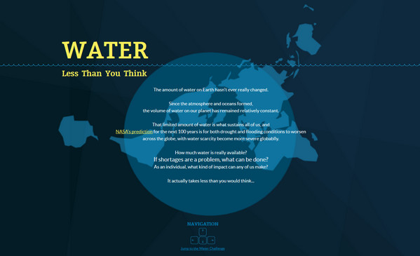
Less than you think
Designed to raise awareness about the global water situation, the Less than you think website is one of the best examples of attention-grabbing Flat UI in web design.
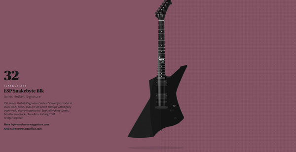
Flat Guitars
Flat Guitars is designed to rock. It is dedicated to popular guitars played by legendary people along with their graphical illustrations. The website is really cool, and it says:
“FlatGuitars is an illustration tribute to all of those guitars I’d like to have in my personal collection and, of course, the guitar heroes behind them that inspire us with their music.
This is an ongoing project. Every week I’ll be illustrating a new guitar beauty. Rock on!”
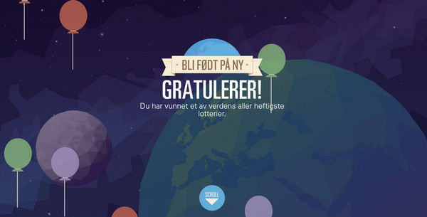
Gjenfodt
Gjenfodt is an stylish website based on high-end vector illustrations. Every graphic pundit will get a spiritual professional satisfaction just by using this website.
Volume 1
Volume1 is one of the coolest websites designed ever centered around Flat UI. This interactive site uses top-notch and highly creative graphics and animations to grab the user attention. A great job. Well done!
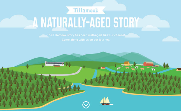
A Naturally-Aged Story
A Naturally-Aged Story is all about visual storytelling. The perfect combination of an eye-popping illustration, graphical storytelling, compelling content and Flat UI.
image sources: Designmodo
Empowered by Apple’s creative team, the Flat UI soon found widespread acceptance by Microsoft, Google, Twitter, Adobe and other big brands. While Microsoft made foray into flat with its Windows 8 operating system, Google and Twitter chose the flat card UI in their results. The Google cards and Twitter cards are nothing but implementation of Flat UI. The ease of optimizing flat design for responsive nature is one of the big reasons behind its success.
Numerous resources have been developed to design and implement a flat design architecture for online purpose. We have flat menus, flat typography, flat pop-ups, and everything can be easily designed while maintaining the flat property.

