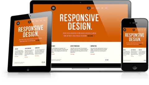
When more than 50% of worldwide internet users decide to go mobile, web designers must keep themselves abreast with latest trends to develop websites suiting the audience’s changing expectations. Not just the device but also the context of ‘how the internet is used’ has changed. Now users access tablets and smartphones everywhere, whether it is a classroom or office. Since these devices do not have exactly same properties, a web designer has to consider a lot of different parameters such as screen size, resolutions, the nature of web layout, etc.
The complete site layout should be designed to enhance better user experience thus rising vertically above the market’s wide open competition. For users who switch between computers and mobile devices, a responsive web design is the best alternative. As a general practice, web designers need to implement methods that would render a “responsive web design” compatible with all kinds of mobile devices. Responsive web designs are cost-effective solutions to renovate your existing templates to fit the mobile layouts. Here are a few pain points that web designers must address:
-
Designing the Basic First
You can consider developing the web page, optimized for the smallest screens first. Later you can extend this design to match the specifications for higher mobile devices in a series of media query breakpoints.
 While it is a matter of personal style and technique, a general idea should be that the breakpoints should be close to each other, say 180 pixels. Also, you will need to consider modifying other features, especially the floating images/video templates, typographic features, etc.
-
Remove the Automatic Zoom Option
Any smartphone user will tell you that while accessing the internet through it, the browsed websites are by default in their full size, therefore giving users little choice to see the whole picture at a time. Since most websites have not yet brought in their mobile versions, it seems that a full layout is a normalized option.
However, with Responsive web design for mobile versions, the default zoom option can make your website clumsy and unattractive for users. More particularly, the icons, call to action buttons, navigation panels, and graphics will get smaller (sometimes too large or bold) while fitting your device’s screen.
What can you do about it? There are many solutions for it, varying from device to device and also dependant on website’s context. One general way to revise this auto-zoom issue is to append a meta tag in your web page’s header.
[highlight]<meta name=”viewport” content=”width=device-width; initial-scale=1.0; maximum-scale=1.0; user-scalable=0;” />[/highlight]
This viewport meta tag will reset the web layout for most of the iPhone and Android devices. The initial scale value will set your webpage’s size to a full scale (i.e.. 100% zoom). User-scalable value is set at zero to ensure that the default zoom function is disabled altogether, thus freezing the design layout into a single-size appropriated for device’s screen width. That way, we get closer to discard the common scaling option so as to provide a better layout on mobile devices.
-
Optimize Content Display
While essential content is the must-show thing for all websites, you can hide those extra content forms such as dynamic menus, image sliders, etc. to reduce webpage’s load. Keeping those content blocks in a minimized form is a good idea so that users don’t have to deal with them simultaneously. You may use JavaScript or CSS to make the necessary changes, subsequently you will need JavaScript code while preparing for a toggle button.
By this, you get a highly dynamic home page that will support the rich web content. Designers will find this method intuitive and simple to handle, especially for devices supporting touchscreen technology. You can either hide those content blocks within a content div or perhaps you may like to arrange all the drop down menus in a columnar format. This solution is perfect since you get an advantage of collapsing the complete menu options with just one tap. Compatible with image sliders, you can consider the optimizing content display to foster dynamic photo sizing.
You can learn more about how to use JavaScript in developing your mobile friendly websites. In particular, Microsoft offers a lot of free learning on JS topics. You can find them online.
-
Use Subtle Color Themes to Retain User’s Focus
You have already noticed that mobile-friendly websites are getting simpler in design day by day. Instead of flashy and bold color palettes, designers need to use simple and soothing color patterns. Bold colors are good to grab attention but at the same time they can also serve as a distracting factor that might interfere with user’s concentration. Having subtle color themes will minimize all the risks of the user being distracted or uncomfortable. So instead of dark and radiant red color, apple green or neon green is more user-friendly.
-
Blur the Background
You may also like to consider blurring the background so that it can make a more visual appeal to the viewer. Another advantage of having the blurred background is that webpage’s important elements gain additional readability. Like if you had a call to action button or a navigation link where you want the visitors to focus on, have the background blurred and add some contrasting color to your desired button or content.
Web designers are witnessing a radical change in the way technology works. For mobile-compatible websites, every day a new trend evolves, discarding the existing practices. In the coming years, we expect all the major websites to offer a mobile friendly website. In such a case, web designers have to update regularly themselves about the transient state of market expectations and technological advancements.
