Minimalist concept has captivated the web design community, and has made its mark as the most stylish trends to have emerged lately. The finest aspect of minimalist design is its compelling story telling ability and sophisticated appeal, which has become a focal point of contemporary internet campaigns and multimedia directives. Further, minimalist websites deliver stunning results for mobile marketing campaignsowing to their mobile friendly design, beautiful appeal and better say at brand narrative.
Minimalist Web Design and User Experience
Minimalist websites are designed with a clear perspective – to say less and mean more. With this design philosophy brands are able to connect more conveniently with their target audience, and the audience itself appreciates the gesture since it makes more sense to them if a brand uses this approach. Hence, the user experience of a site with minimalist design is usually found to be better than their more traditional counterparts. It is interesting to note that minimalism has evolved from simple artist portfolios to corporate websites and many popular e-commerce web portals.
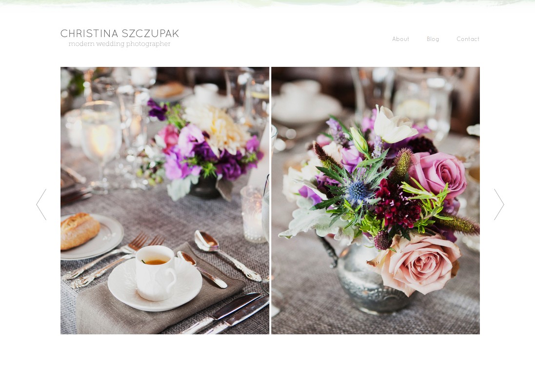
Christina Szczupak’s brilliant wedding photography portfolio website has the quintessential essence of contemporary minimalist web design. Image courtesy – christinaszczupak.com
It must be noted that if it weren’t for the users, minimalism wouldn’t have become a fad that it is today. Web designers invented this concept, people appreciated it, and then more designers followed the suit and explored more innovative ideas. This is the reason why minimalist web design achieved such a phenomenal mainstream success in such a short span of time.
No More Ridiculous Design Clashes Within A Page
As web designers, we face situations where we are required to use different design schemes within the same web page, even though subconsciously we are aware that it is a major design blunder. We may be put in such a situation because of an undiscerning client or because of a certain project requirement. Minimalist web design’s strongest feature is its ability to absolve different design elements within single page without compromising on the integrity of overall website. This avoids unnecessary clutter and confusion on the web page, and message is clearly communicated with the intended audience.
Further, constricted amount of design elements within a single page of a minimalist website are better effective at brand marketing, since the end result is created with superior user experience in mind. This ultimately creates a better brand image in the eyes of target customers, which positively impacts better lead to sales conversion.
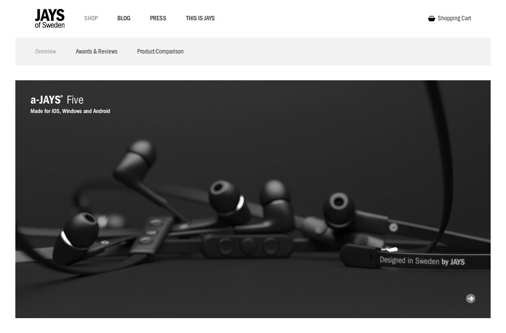
Jays earphones – a Sweden-based e-commerce portal should be the standard for all modern minimalist e-commerce websites. Image courtesy – www.jays.se
Practical and Cost Effective Nature
Minimalist concept was invented while keeping the practical, logical and functional aspects of contemporary web design, such that the next generation web is more user oriented and easier to comprehend, besides requiring small input cost and maintenance. These are just few of the many notable benefits of minimalism in terms of modern digital design. Minimalist websites can be designed and put online within a short span of time, consume less resources for programming and testing, besides less expenditure on the entire production phase. In all fairness, they present a quick, practical and brilliant way of delivering ultramodern web solutions.


I high appreciate this post. It’s hard to find the good from
the bad sometimes but I think you’ve nailed it! would you mind updating your
blog with more information?
http://www.premierpc.com.au/
Hey Jason, thanks for the kind words. What do you have in mind?