The Parallax effect is one of the hottest web design trends at the moment. You might have come across it on video games, digital imagery and more recently websites and mobile apps. It’s not just eye catching but also presents a fantastic way of crowd engagement and leaving a mark on people visiting a website.
Parallax scrolling remains a controversial element of modern web design practices with many designers going both in favor and against it. The effect as they say, parallax scrolling is a graphic design and animation technique where background images move relative (usually slower) to the foreground image, creating an interesting illusion.
The concept gave a selective platform to innovative web design folks looking to set trends and make a name for themselves. However, the public opinions were mixed about the parallax effect. The gaming industry accepted the new animation feature with open hands and still do, while web designers didn’t share the same level of enthusiasm as their fellow animation peers did. However, parallax scrolling trend eventually made its mark in the industry, mostly due to Nike who redid their website using the same concept.
The Nike website – a great example of Parallax effect
Parallax Scrolling in theory – How it works?
The parallax effect is an animation illusion of depth. In theory, it works by creating an 2D illusion by moving two or more images in relative fashion to each other. The result is an advanced graphic-animation experience that actually is all about two objects moving at different velocities and creating a spectacular visual effect.
In all fairness, it offers a stylish and avant-garde way of displaying content on a web page. Just like when we say Card UI is the best thing in web design, parallax scroll effect isn’t so far behind as well.
Get parallax scrolling on your website
The easier way – CSS3
Designers know that parallax scrolling isn’t a piece of cake, and is not easy to implement for newbies. However, creating a complex parallax effect has become easier with the advent of CSS3. The most common practice is to use content on a single page and create the effect using subpages with CSS transitions. Sounds simple, but isn’t!
This could well be an alternate route to have the parallax effect on your website, and a much easier option from the browser loading point of view. Further, many browsers aren’t compatible with CSS3 transitions, which is where the parallax plan goes kaput.
The hard way way (Best way) – JavaScript
JavaScript the absolute medium to design and create parallax effect on websites. Let’s take a look at few of my favorite JavaScript based plugins designed for the same.
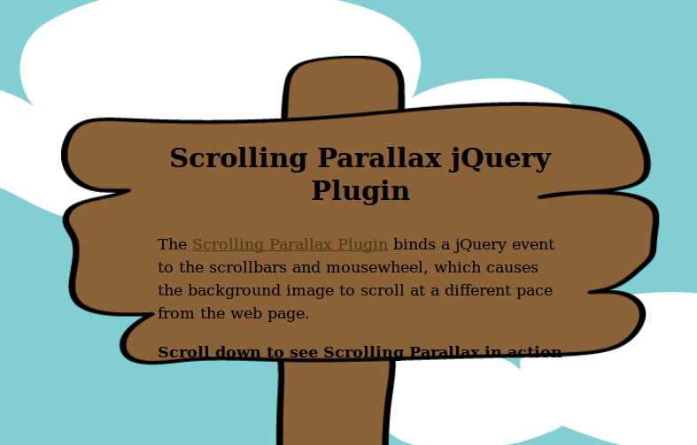
Scrolling Parallax jQuery Effect
A simple parallax jQuery plugin that works extremely well creating a nice illusion of depth. Interesting option, ideal for both advanced and new designers.

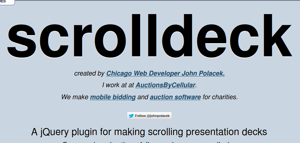
Scrolldeck
The easiest plugin to create parallax effect on websites. Boon for web designers!

Parallax Scrolling – The final cue
The parallax scrolling effect is fast becoming popular these days, mostly because of decreasing complexity in its design. However, parallax illusion is still difficult to build from scratch and sometimes opens doors to never ending page load and browser compatibility issues. The two ways – CSS3 and JavaScript have their own perks and downticks. The former might be easy to implement, but cannot match the user experience delivered by JavaScript plugins.


