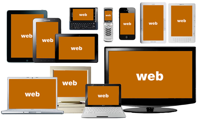
Responsive Web Design, the term, however heavyweight it may sound, is simply a new age concept of developing websites that change according to the user’s computer screen resolution.
Using this modern model websites are designed in an advanced 4 column layout, with the width of 1292 pixels, on a 1025 pixel width screen, that auto simplifies into 2 columns.
Responsive Web Design is nothing but an extension of the ever evolving technology. Websites designed using this theory also comfortably fit on the screens of smartphones and computer tablets. This designing technique is distinctive version than the traditional way of web designing and development.
Designing is a creative art and creativity is ingrained. Every designer in that respect is a creative entity giving pumping life into text through his breathtaking designs. Creativity when coupled with the latest technology only leads to unthinkable marvel. Web Design is one such wonder born out of a creative technological mix.
Courtesy: http://bradfrostweb.com/blog/web/mobile-first-responsive-web-design/
Although every designer is well versed with his job, it is important for him to understand the essentials, procedures, intricacies and particulars involved with the latest technology used in his forte domain.
Responsible Web Design is the step ahead in the world of technology that makes use of scalable images and adjustable layouts. Today’s Responsive Websites take an analogous approach by using fluid widths in percentages and ems The whole concept therefore, revolves around the kind of screen-size to be used while surfing a particular website.
Fundamentals in Responsive Web Design:
• Flexible Layouts
• Flexible Images
• Media Queries
Flexible Layouts
This is the first step involved in Responsive Web Design. With every change in browser width, the fluid grids tend to resize and reposition the content. Tiny Fluid Grid is a free yet magnificent tool for creating flood grids.
Flexible Images
As cliché as it may sound, adjustable images play a significant part in Responsive Web Design technique. Images can be resized either on the fly or through the process of dynamical cropping. Combination of both these processes enables the image to resize itself automatically when it is below a particular size.
Media Queries
Media Queries allows the designers to produce multiple layouts using the same content. To achieve scalability, CSS media queries are used to apply different page styling according to certain parameters, like min-width and orientation.
Owners of websites must utilize the Responsive Web Design services to gain visitor traffic to their websites and earn as much business.

